Why Alphato Properties needed more than a brochure site
When Alphato Properties came to us, they were already active in Abuja's real estate market. They had development projects, sales teams and a growing list of interested buyers. What they did not have was a website that reflected how people actually search for property.
Most real estate sites in Nigeria fall into one of two traps. They are either slow directories with thousands of stale listings, or glossy brochure pages that look good but tell a buyer nothing about price, payment plans or project status. Alphato wanted neither. They wanted a site that would help a serious homebuyer or investor move from “I am looking” to “I want to see this property” in a few minutes.
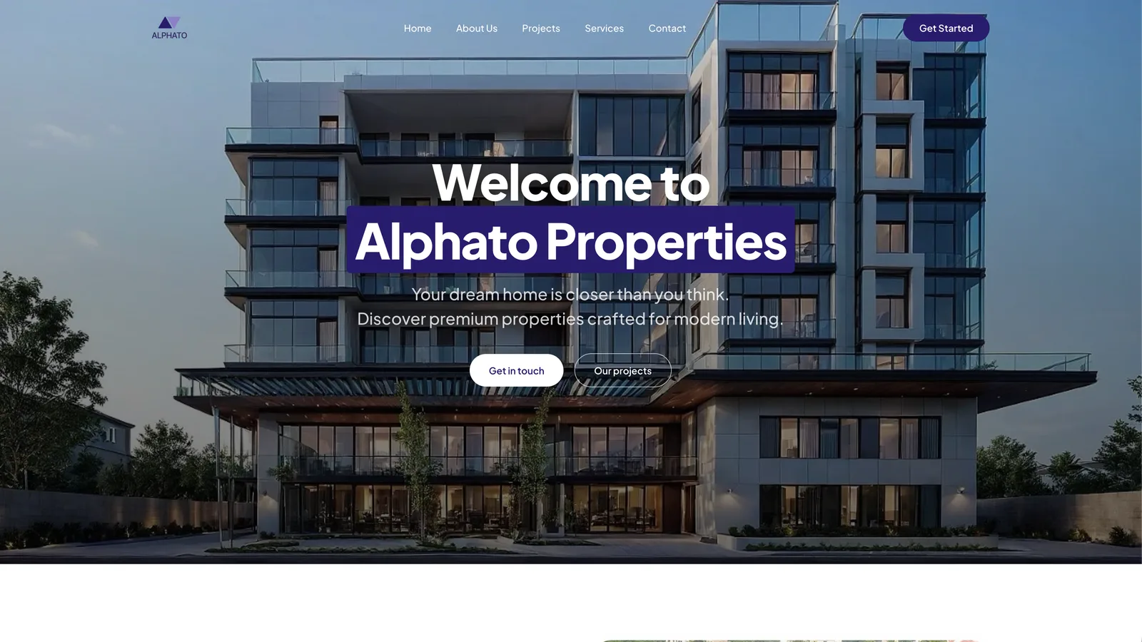
We treated that as the core product problem, not a design problem. The result is the Alphato Properties website: a focused platform for affordable luxury homes and development projects in Abuja.
The three challenges we set out to solve
Before writing a single line of code, we mapped the journey of two types of visitors: a first-time homebuyer and a real estate investor. Both had the same frustrations.
1. Scattered and unreliable property information
Buyers were comparing properties across WhatsApp messages, PDF brochures and third-party listing sites. Prices were often missing or outdated. Payment plans were vague. A buyer could spend days gathering basic facts that should have been on one page.
We solved this by making every project page carry the same structured information: location, unit types, price range, payment plan and development status. No hidden details. If a buyer wants to compare two projects, they can do it without opening five tabs.
2. No clear distinction between “available” and “coming soon”
Many property sites mix sold-out units with future phases. That wastes time and erodes trust. On the Alphato site, each project is labelled clearly. A visitor knows immediately whether they can buy now, join a waitlist or register interest for an upcoming phase.
3. Slow and indirect enquiry handling
A property website fails if a serious buyer has to hunt for a phone number or fill a long form. We kept the enquiry flow short: name, contact detail and the project they are interested in. The team at Alphato receives the message directly and can respond while the buyer is still on the site.
What we built and why
The Alphato Properties website is not a listing marketplace. It is a curated portfolio of the company's own projects. That changed our design decisions. Instead of optimising for thousands of pages, we optimised for clarity on a smaller number of high-intent pages.
Project pages that answer real questions
Each project page answers the questions we heard most often from buyers: Where is it? What does it cost? What is the payment structure? Is it ready or under construction? What makes it different from other projects in the same area?
We used a consistent layout so returning visitors do not have to relearn the site. The goal was to make the information feel familiar, not clever.
Search and filtering that respects the user's time
Visitors can filter by property type, location and status. We deliberately kept the filters simple. Too many options create decision fatigue. A buyer looking for a three-bedroom apartment in a specific district should reach the right project in one or two clicks.
Mobile-first, because that is where buyers are
Most Abuja property searches start on a phone, often late at night or during a commute. We built the site mobile-first. Images load fast, text is readable without zooming and the enquiry buttons are easy to tap. A slow mobile site would have undone every other decision we made.
What this project shows about how we work
The Alphato Properties website is a good example of our approach to client projects. We do not start with a template and fill in the client's logo. We start with the problem the client's customer is facing.
For Alphato, that meant spending time understanding how Abuja homebuyers and investors make decisions. We looked at the questions their sales team was answering repeatedly. We looked at where visitors were dropping off on their old site. Then we built the smallest useful version of the new site and refined it based on real feedback.
We also made a deliberate choice to avoid heavy animations, autoplaying videos and other features that slow a site down. A property buyer wants facts, not a show. The site loads quickly, ranks for relevant local searches and gives the Alphato team a simple way to update projects as phases sell out or new ones launch.
What we would do again
Three decisions stand out as worth repeating on future property projects.
Structured project data from day one. Every project page follows the same template. This makes the site easier to maintain and easier for buyers to compare. It also helps search engines understand what each page is about.
Short enquiry forms. We asked for the minimum information needed to start a conversation. Longer forms generate fewer quality leads. A buyer who is ready to talk does not want to fill a survey.
Clear status labels. “Available”, “Selling fast” and “Upcoming” are simple labels, but they set the right expectation. They reduce wasted enquiries and make the sales team's job easier.
Lessons for anyone building a property website
If you are planning a real estate website in Nigeria, here is what we would suggest based on this project.
- Do not hide prices. A buyer who cannot see a price will assume the property is out of their budget and leave.
- Show payment plans clearly. Many buyers in Abuja are comparing instalment options, not just total cost.
- Make every project page self-contained. A buyer should not need to call you to learn the basics.
- Optimise for mobile speed. A beautiful desktop site that takes eight seconds to load on a phone is a liability.
- Give the client a way to update listings without calling a developer. Alphato's team can add new phases and update statuses themselves.
Why this matters for homebuyers and investors
The Alphato Properties website works because it respects the user's time. A homebuyer can see what is available, understand the payment plan and contact the developer in minutes. An investor can compare projects and decide which one fits their budget and timeline without chasing a sales agent for basic information.
That is the real product outcome. The website is not just a digital brochure. It is a tool that shortens the distance between interest and action.
If you are planning a property website, a client portal or any platform where clarity and speed matter, we would be happy to talk. You can see what we build and how we approach projects on our services page, or check starting prices on our pricing page.